The existing website contained valuable content – but struggled to turn that into action.
Users faced:
What did this mean? A disconnect between expertise and experience.
The new site needed to:
Everything needed to feel intentional.
We approached the redesign through a behavioural lens – understanding not just what users need, but how they think and decide.
Using UX audit insights and journey mapping, we identified two core audiences:
Each group arrives with different motivations – but the same need:
confidence in what to do next.
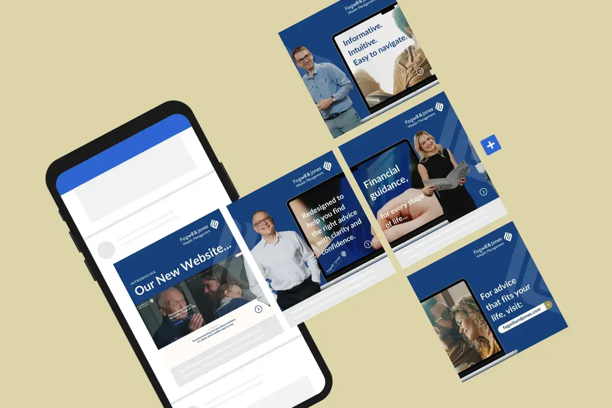
From there, we built a strategy around:
The goal wasn’t just usability.
It was reassurance.
01.
05.
Within weeks of launch, Fogwill & Jones saw a measurable increase in qualified leads – a clear signal that the experience is not only attracting attention, but converting it.
This uplift reflects more than performance; it demonstrates a user journey that now works with, rather than against, how people make decisions. By simplifying pathways, surfacing the right information at the right time, and removing unnecessary friction, users are able to move forward with greater ease and confidence.
The result is a digital experience that builds trust earlier, supports better decisions, and turns intent into meaningful action.
Because it aligned with how people actually make decisions.
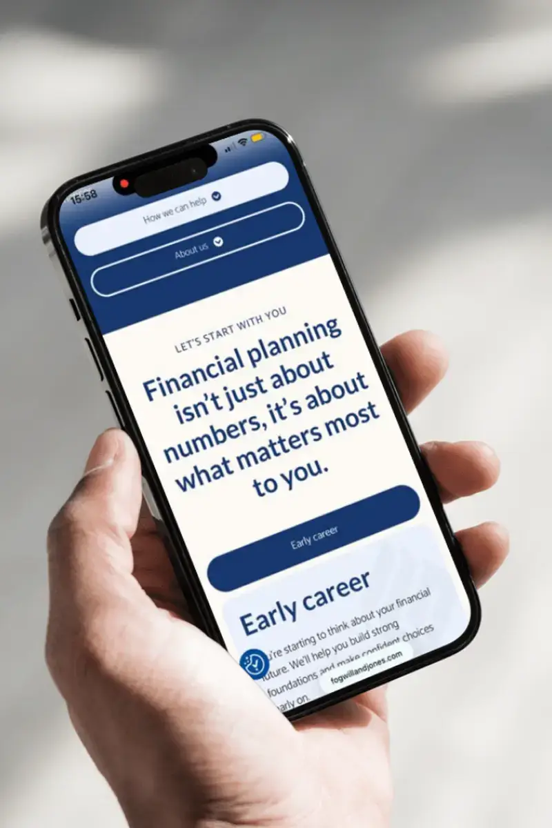
Financial decisions are rarely just logical – they’re emotional, often uncertain, and deeply personal.
By reducing complexity and increasing clarity, the new experience builds trust earlier, removes barriers to action and helps users feel understood – not overwhelmed
Clear journeys.
Relevant content.
Confidence at every step.
Tell us what you’re working towards – we’ll help you move it forward.