Which one of us hasn’t had countless tabs open at the same time as we are studying, researching or perhaps shopping for something special! How are you able to distinguish from all these different sites, even when the meta description gets cut off? It’s the tiny logo in the left corner of your tab called favicon. Seemingly small and insignificant, it is actually a very powerful branding tool that you don’t want to leave out from your website design. Here’s why and how you can create the perfect favicon!
Where does it appear?
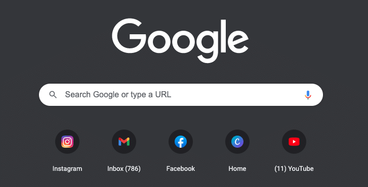
A favicon appears in more than just your browser tab!

(Favicons in tabs)
You will also find it in your most popular websites when you open your browser, as well as bookmarks, RSS feeds and more.
(Favicons in the browser screen)

(Favicons in bookmarks)
With this level of consistent presence, not having a favicon is a missed opportunity for your business. Every time it appears on all of these different channels, it reinforces your brand and makes it more memorable. It may seem like a tiny detail, but users will notice when a website doesn’t have a favicon and it will look like something’s missing. Having a memorable and eye-catching favicon will help them recognise your branding every time they see it.
Favicon: Best practices
You will likely notice that many favicons don’t contain the full logo of the brand. While using your full logo might seem like a great idea, remember, you only have a very small amount of space to fill. That’s why your favicon needs to be simple, memorable and eye-catching. This sometimes means only using a certain element of your logo or creating a favicon that represents your branding in a simplified way.
Transparent or not?
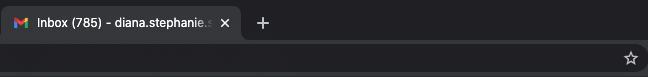
You will likely see Favicons with either a transparent or opaque background. For example, Gmail Favicon features a transparent background:
Whereas our MacMartin Favicon has a teal background:

Which one is better? That depends on your branding, however, letter-based Favicons tend to look better with a colourful background, whereas symbol-based Favicons look better with a transparent background. But there is, of course more nuance to this. Do your logo colours stand out against different backgrounds, for example, if your visitors are in light or dark mode? Maybe it would work better if you inverted the brand colours? Are there certain elements of your logo that would work best for the Favicon? Let’s have a look at some examples for more inspiration…
Turning your logo into a Favicon
Here’s a website we designed for Over the Rainbow Children’s Books:
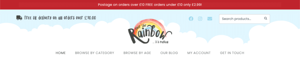
As you can tell, their logo features a lot of writing which would not look effective in a tiny format. So we took the rainbow element from it and created this favicon:

It is consistent with their branding and it’s easy to recognise in a much smaller size.
This website for Lightbulb features a similar theme:

We took the yellow love heart from their logo and used that as a favicon – it creates a great contrast across different browsers and it’s easy to locate immediately.

When it comes to our own favicon, it’s the same as our logo and its teal background makes the letters stand out across different channels and browsers:
The key here is to keep your branding consistent, recognisable, while using a simplified design if necessary.
Favicon formatting
Finally, we get to formatting your favicon. It can appear as small as 16 x 16 pixels and as large as 260 x 260 pixels. You want to format it in a way that will match the different sizes and also work well on each platform. The most popular formats are ICO and PNG. They will work on all platforms, however, ICO does have the upper hand over PNG, because you will be able to upload it with different file sizes. Other image formats can be a bit hit or miss, depending on which platform they are on. You may want to use a GIF format, however, we’d recommend keeping it as simple as possible. Motion favicons may distract your users from browsing your site, which isn’t optimal. You want it to provide a consistent, memorable branding, without taking too much attention away from your content.
Do you need a website?
Our marketing team can build you the perfect website to match your branding and give your business the representation it deserves! We will take care of everything down to the finer details, so your website can be properly optimised and entice your visitors to stick around. Contact us today to find out more about our services.